
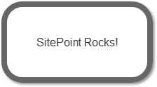
How to Create CSS3 Speech Bubbles Without Images
Credit: https://www.sitepoint.com/pure-css3-speech-bubbles/
I remember my creating my first image-less speech bubble many years ago. It required a long-winded JavaScript function to inject elements into the DOM, some horrendous CSS, looked fairly awful, and didn’t work well in IE5.
CSS3 is starting to change our lives for the better. It’s now possible to create a great looking speech bubble which works in all browsers, uses a single HTML element, a few lines of CSS3 code, no images, and no JavaScript whatsoever…
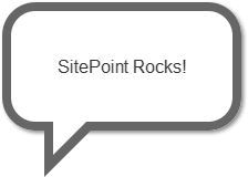
To ease you in gently, let’s examine the HTML. A single element is required, so I’m using a P tag:
<p>SitePoint Rocks!</p>
First, we’ll style the outer box:
	p.speech
	{
	position: relative;
	width: 200px;
	height: 100px;
	text-align: center;
	line-height: 100px;
	background-color: #fff;
	border: 8px solid #666;
	-webkit-border-radius: 30px;
	-moz-border-radius: 30px;
	border-radius: 30px;
	-webkit-box-shadow: 2px 2px 4px #888;
	-moz-box-shadow: 2px 2px 4px #888;
	box-shadow: 2px 2px 4px #888;
}
Nothing too complicated there. The only essential property is position: relative which is necessary for the speech bubble pointer. We also require Mozilla and Webkit vendor prefixes for border-radius and box-shadow to ensure they work in all CSS3 browsers. IE8 and below will show squared corners and no shadow, but the box will still be visible.
Now we need to create the triangular bubble pointer. Rather than resorting to images, we can use CSS borders to create any type of triangle. As a brief explanation, examine an element with wide differently-colored borders:

If we reduce the width and height of our element to 0px and use different sized borders, we can see different triangles being formed:

For our speech bubble pointer, we can therefore use a solid top and left border with transparent right and bottom borders:

But what do we assign those border properties to? Fortunately, we can use the CSS :before and :afterpseudo-elements to generate two more content items. Therefore:
	p.speech:before
	{
	content: ' ';
	position: absolute;
	width: 0;
	height: 0;
	left: 30px;
	top: 100px;
	border: 25px solid;
	border-color: #666 transparent transparent #666;
}
The triangle is positioned at the bottom of our bubble. Incidentally, don’t bother trying to apply a shadow to this element — it’ll be shown around the transparent borders rather than the visible triangle.
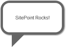
We must now remove a section of this triangle. We can position a smaller white triangle over the gray one to achieve that effect:
	p.speech:after
	{
	content: ' ';
	position: absolute;
	width: 0;
	height: 0;
	left: 38px;
	top: 100px;
	border: 15px solid;
	border-color: #fff transparent transparent #fff;
}
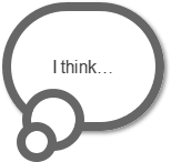
Our pure CSS3 image-less speech bubble is complete.
In essence, we can utilize the :before and :after pseudo-elements to create many different effects. For example, a thought bubble can be created with two content items rounded into circles:
	p.thought
	{
	position: relative;
	width: 130px;
	height: 100px;
	text-align: center;
	line-height: 100px;
	background-color: #fff;
	border: 8px solid #666;
	-webkit-border-radius: 58px;
	-moz-border-radius: 58px;
	border-radius: 58px;
	-webkit-box-shadow: 2px 2px 4px #888;
	-moz-box-shadow: 2px 2px 4px #888;
	box-shadow: 2px 2px 4px #888;
}

p.thought:before, p.thought:after
{
	left: 10px;
	top: 70px;
	width: 40px;
	height: 40px;
	background-color: #fff;
	border: 8px solid #666;
	-webkit-border-radius: 28px;
	-moz-border-radius: 28px;
	border-radius: 28px;
}

p.thought:after
{
	width: 20px;
	height: 20px;
	left: 5px;
	top: 100px;
	-webkit-border-radius: 18px;
	-moz-border-radius: 18px;
	border-radius: 18px;
}
Please see the demonstration page for an example which uses these techniques. All the CSS code is contained in the HTML source.
APPLY NOW
Benefits

RiverCrane Vietnam sympathizes staffs' innermost feelings and desires and set up termly salary review policy. Performance evaluation is conducted in June and December and salary change is conducted in January and July every year. Besides, outstanding staffs receive bonus for their achievements periodically (monthly, yearly).


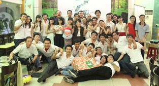
Activities such as Team Building, Company Building, Family Building, Summer Holiday, Mid-Autum Festival, etc. will be the moments worthy of remembrance for each individual in the project or the pride when one introduces the company to his or her family, and shares the message "We are One".